Choosing a memorial theme usually happens in an emotional, practical moment: the family has selected a photo, the obituary is being written, and someone asks, “What should the page look like?” The right answer is rarely about design trends. It is about whether the page feels true to the person being remembered and easy for the family’s community to read on a phone.
Why the Theme Matters
When a family member or friend opens the tribute page, the first impression comes from the visual design. The theme determines:
- Colour palette — warm earth tones, cool blues, or classic black and white
- Typography — elegant serifs, clean sans-serifs, or a mix
- Layout — how the photo, obituary, and interactive features are arranged
- Mood — a celebration of life feels different from a traditional funeral tone
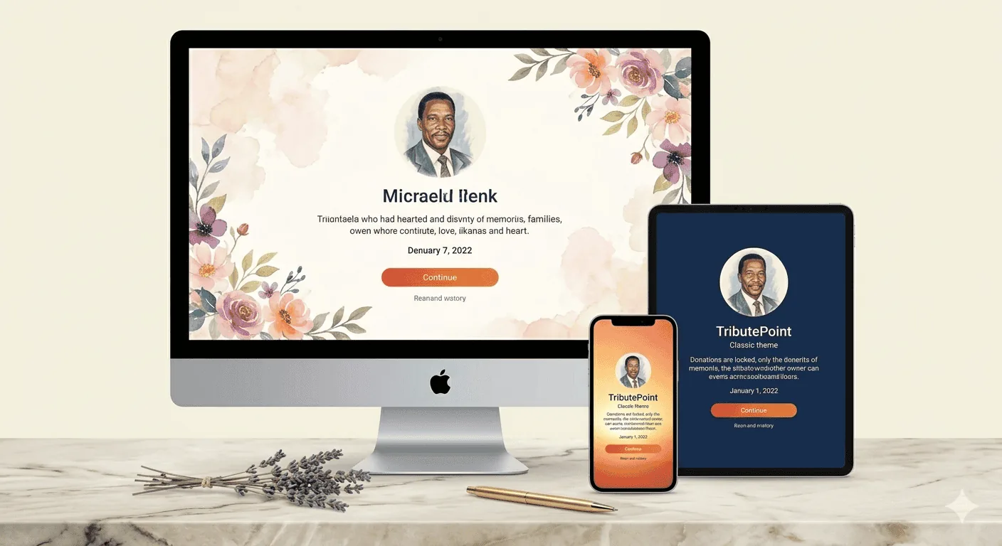
A well-chosen theme honours the person’s personality. A vibrant, colourful theme might suit someone who was the life of every party, while a minimal, white design might reflect someone quiet and elegant.
The 9 Standard Themes
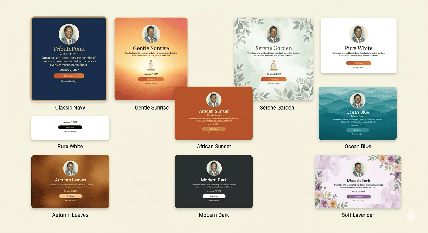
Every TributePoint user gets access to all 9 standard themes at no cost. The practical difference between them is not complexity — it is tone. Some feel quiet and formal, some feel warm and family-centred, and some feel more like a celebration of life.
To choose a theme, open the tribute editor and click on the Theme tab. Thumbnails of every available theme appear. Click one, and the tribute updates instantly. Families often find it easiest to compare two or three options side by side and ask a simple question: “Would this have felt like them?”
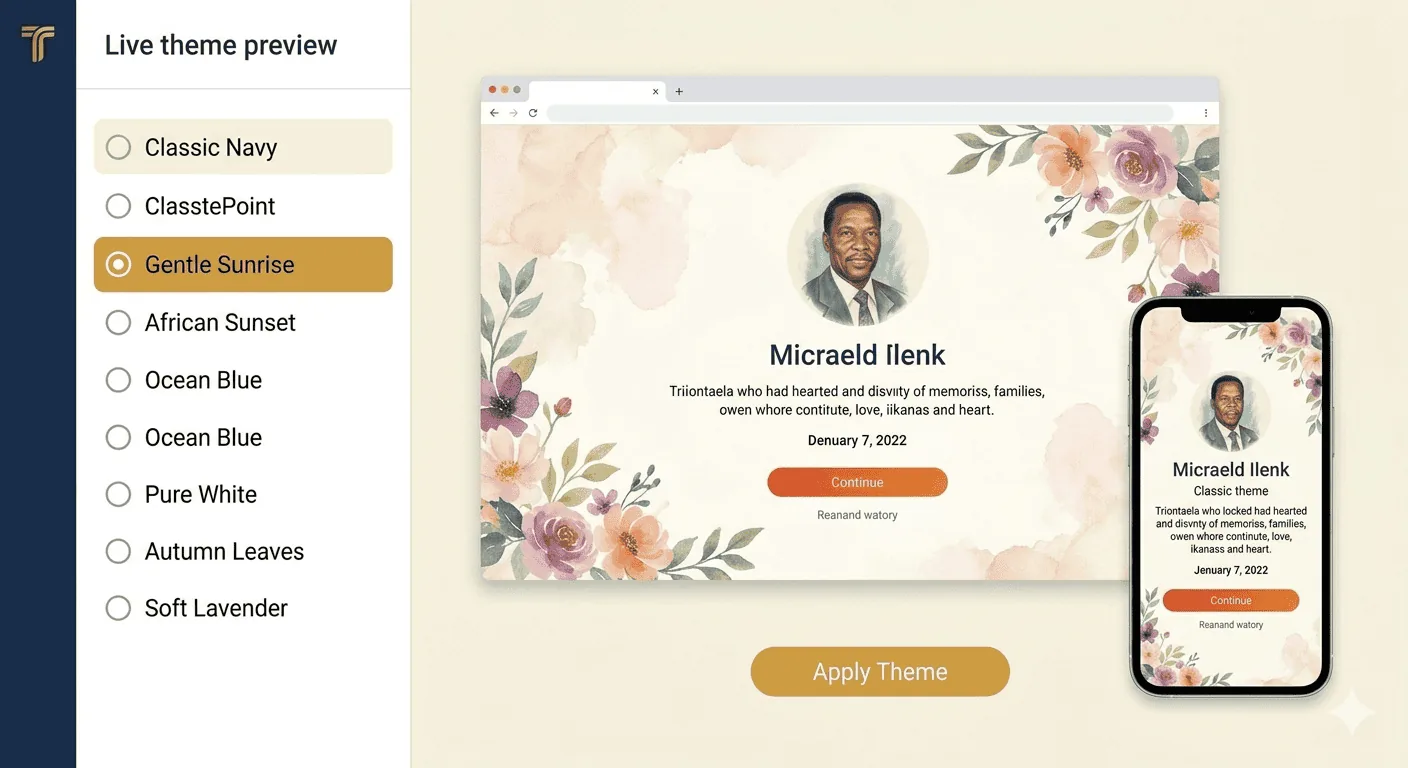
Not sure which theme to pick? Try the live preview — click the preview button to see the full memorial page with your chosen theme, photos, and obituary text, exactly as visitors will see it.
Choosing a Theme for Real Families
For a parent or grandparent: Families often lean toward calm, dignified themes with readable text, a strong portrait area, and space for a fuller obituary. This works well when the page will be shared with church members, neighbours, and older relatives.
For a child: Families usually prefer something softer and more gentle — often lighter colours, floral elements, or a design that feels tender rather than formal. The page should make room for photos and messages without feeling crowded.
For a church funeral: A more traditional layout often feels right, especially when the programme, scripture, venue details, and livestream information all need to be easy to follow on the same page.
For a celebration of life: Brighter tones and more expressive layouts can work well when the family wants the memorial to reflect warmth, storytelling, and a life remembered with joy as well as grief.
Paid plans may unlock extra theme options for funeral homes, but for most families the real task is not choosing the “best” theme. It is choosing the one that fits the person, the ceremony, and the visitors who will be reading it.
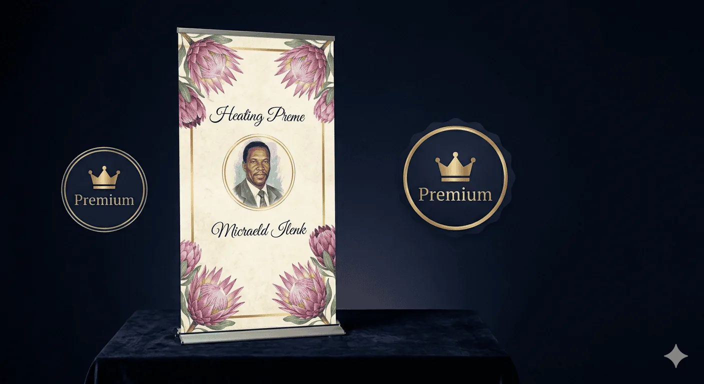
- Premium Themes — additional designs with more complex layouts, animations, and typography choices
- Exclusive Themes — top-tier designs available only on the Enterprise plan, with unique visual elements
If a funeral home is helping the family, it can still keep the choice family-led by showing a few fitting options instead of overwhelming them with every variation.
Live Preview: Desktop & Mobile
The theme preview page shows both a desktop and mobile screenshot of the memorial, so you can check how it looks on both devices before committing. This is important because most South Africans access tribute pages on their phones.
The Theme Gallery
TributePoint has a public theme gallery at /tributes.php where anyone can browse all available themes. The gallery includes SEO-optimised structured data and an FAQ section, making it easy for families and funeral homes to discover the right design through search engines.

Company Branding
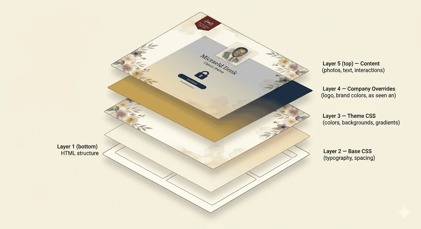
Funeral homes can go beyond themes with full company branding:
- Logo upload — your company logo appears on every tribute your team creates
- Brand colours — set primary and accent colours that override the theme defaults
- Custom CSS — inject your own stylesheet for pixel-perfect brand consistency
- Custom themes — upload or request a theme designed specifically for your company
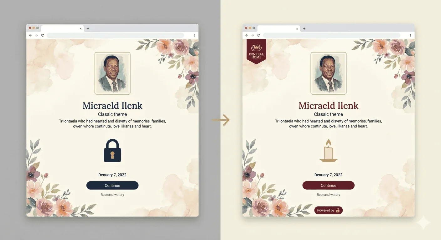
Consistent branding builds trust with families. When every tribute from your funeral home has the same logo and colours, it signals professionalism and care.
Requesting a Custom Theme
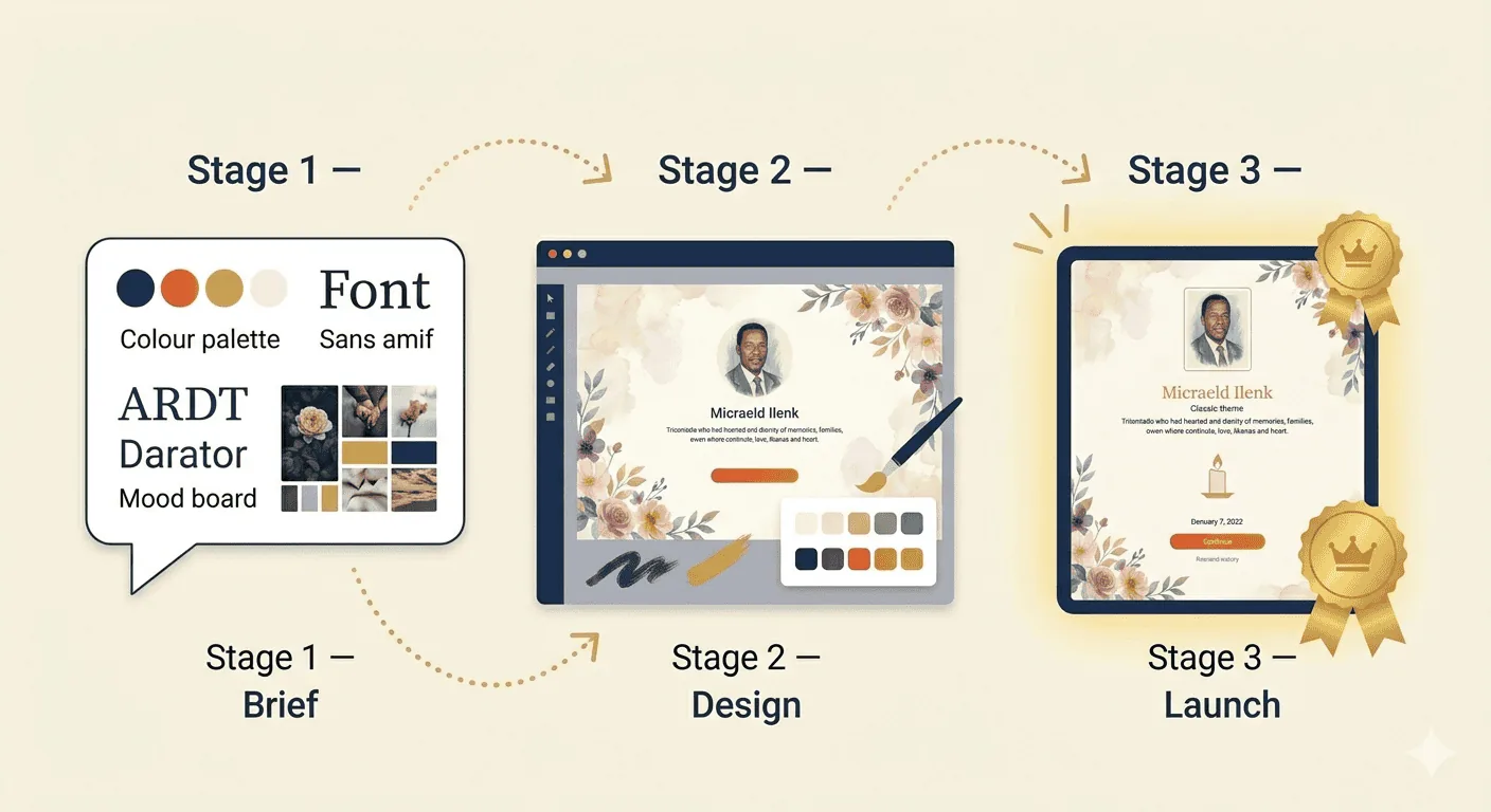
If none of the existing themes fit your brand, companies on paid plans can request a custom theme. TributePoint’s team will design a theme that matches your exact specifications — typography, layout, colours, and visual elements.
Every Theme Is Responsive
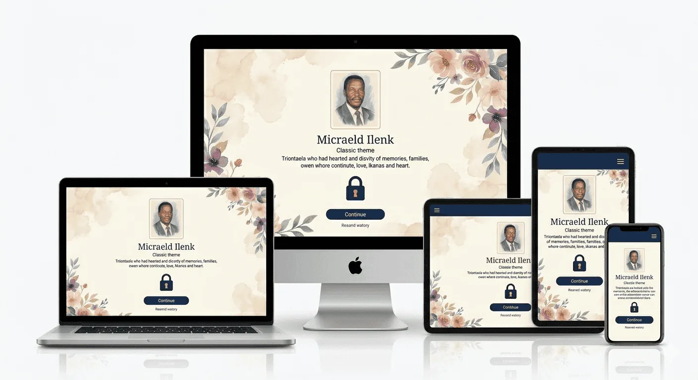
Every TributePoint theme is built to look perfect on any screen size — from large desktop monitors to smartphones. Text reflows, images resize, and navigation adapts automatically. Families and visitors never need to pinch or zoom.
What to Check Before You Publish
Before the page goes live, open it on a phone and check three practical things: the main photo crops well, the obituary text is easy to read without zooming, and the important service details are visible near the top. If the family is sharing the link widely on WhatsApp, those three checks matter far more than any behind-the-scenes design system.
- Readability — can older relatives read the body text comfortably on a small screen?
- Tone — does the colour palette match the person and the type of service?
- Sharing — does the page still look clear when the link is sent to relatives who will only open it on mobile?
If the family also plans to print a programme or share the link in WhatsApp groups, it helps to check how the chosen theme works with the selected photo and service details together, not just the theme in isolation.
The Psychology of Colour in Memorial Design
Colour sets the mood before anyone reads a word. On a memorial page, the palette you choose is not just a design decision — it says something about the person, their culture, and how their family wants them to be remembered.
White means different things to different people. In many African and Christian traditions, white represents purity and transition — a clean passage to the next life. Zulu funerals often incorporate white in mourning attire. In Hindu communities, white is the mourning colour: the bereaved wear white, and cremation ceremonies are draped in it.
Black is what most people think of when they think of funerals — Western tradition, Afrikaans tradition, formal services. But not every South African culture sees it the same way. Some communities wear black only during the mourning period and switch to brighter colours for the celebration-of-life ceremony.
Gold and warm earth tones say "honour" and "legacy." You see these in memorial materials that celebrate a life well-lived rather than dwelling on loss. In many African traditions, gold and ochre connect to ancestral reverence — the idea that the person has joined those who came before.
Floral and nature palettes — soft greens, lavenders, and rose tones — evoke garden imagery, renewal, and peace. These are popular choices for women, children, and families who prefer a gentle, comforting aesthetic.
When choosing a memorial theme, consider the person's cultural background, their personality, and the tone the family wants to set. A vibrant, colourful theme may suit a celebration of life for a beloved community figure, while a sombre, elegant theme may be more appropriate for a formal, traditional funeral.
Choosing a Theme Based on Personality
The best memorial themes reflect who the person actually was. A retired school principal who wore a blazer every day? Classic navy and gold. A 25-year-old graphic designer who lived in sneakers and neon? Something modern and bold. There is no rule that says a memorial must be sombre — it should feel like the person it honours.
Religious families often prefer themes that incorporate spiritual imagery — crosses, doves, and candles for Christian families; crescent moons and geometric patterns for Muslim families; lotus flowers and flame motifs for Hindu families. The theme should feel familiar and respectful to the community that will visit the memorial page.
Practically, consider the audience. If most visitors will be elderly family members viewing the page on a phone with small text, choose a theme with high contrast, large fonts, and simple navigation. If the memorial will be shared widely on social media, choose a theme that generates a compelling Open Graph preview image — this is what people see when the link is shared in a WhatsApp chat or Facebook post.
Accessibility and Readability
A memorial page will be visited by people of all ages — including the 78-year-old gogos who can barely see their phone screens and have never used a website in their lives. If those visitors cannot read the text or figure out how to scroll, you have lost them. Accessibility is not a nice-to-have; it is basic respect.
What does that mean in practice? Text needs enough contrast against the background (at least 4.5:1 ratio), body text should be at least 16px on phones, headings should follow a logical order so screen readers can navigate, and every image needs a text description for people who cannot see it.
Mobile is not a secondary consideration in South Africa — it is the primary one. ICASA research shows over 90% of South Africans access the internet on their phones. A memorial theme that looks stunning on a 27-inch monitor but falls apart on a R1,500 Samsung from Game has failed the people who actually need to use it.
Preview a Theme With Your Family in Mind
Browse the theme gallery, then choose the option that feels right for the person and stays easy to read on a phone.
Browse ThemesChoosing a Theme That Fits a South African Funeral
One thing we have learned from working with South African families is that a memorial theme is not really about decoration — it is about whether the page feels like the person being remembered. A theme that works beautifully for a young Cape Town professional can feel out of place for a grandmother in KwaMashu, and the other way round. Below are the patterns we see most often, with practical guidance for each.
Traditional African Family Settings (Townships, Rural Areas, Older Loved Ones)
For an elder who lived through the older customs — isiXhosa-speaking grandmother in Mthatha, a Pedi koko in Polokwane, a Tswana mokgalabje in Mafikeng — families usually want a theme that feels respectful and unfussy. Deep navy, dark green, or warm earth-tone themes tend to read better than bright pastel options. The portrait photograph carries most of the emotional weight, so choose a theme that gives the photo room to breathe rather than one with busy decorative borders. If your family will be reading the page during a night vigil with the screen passed around on phones, dark backgrounds with high-contrast text are easier on tired eyes than light themes with thin fonts.
Christian and Church-Centred Families
For families where the deceased was active in a church — ZCC, Methodist Manyano, Catholic, NG Kerk, AFM, Rhema — a theme that includes a subtle cross or candle motif tends to feel right. Many families add a favourite Bible verse to the biography section (Psalm 23, John 14:1–3, and 2 Timothy 4:7 are the three we see most often). If the church will be sharing the link from the pulpit on the Sunday after the funeral, a clean, readable theme is more important than a decorative one — older congregants will be opening the link on small phone screens.
Muslim Families (Janazah Within 24 Hours)
For Muslim families, the funeral itself happens very quickly, so the memorial page is often built and shared within hours of the death. Choose a calm, dignified theme — soft greens, deep blues, or neutral cream tones — and avoid themes with crosses or other non-Islamic symbols. Many families add the phrase "Inna lillahi wa inna ilayhi raji'un" ("To Allah we belong and to Him we shall return") to the top of the biography. The page tends to be most active for the first three days (the traditional condolence period) and again at 40 days, so do not rush to mark anything as "complete."
Hindu Families (Antyesti and the 13-Day Period)
For Hindu families, particularly in Durban, Chatsworth, Phoenix, Lenasia and Laudium, the rituals continue for 13 days after the cremation, with a major prayer ceremony on day 13. A warm gold-and-white or saffron theme reflects the traditional aesthetic. Families often want to add multiple ceremony dates — the cremation, the asthi visarjan (immersion of ashes), and the 13th-day prayer — so a theme with a clear events section is worth more than one with elaborate visual decoration.
Jewish Families (Shiva and Sheloshim)
For Jewish families in Glenhazel, Houghton, Sea Point, Sandton or Cape Town's southern suburbs, the burial happens within 24 hours where possible, then the family sits shiva for seven days. A restrained, classical theme — deep blue or charcoal with serif typography — tends to feel appropriate. The page is most useful as a way to coordinate shiva visits and meals across the seven days, so a clean events list and the home address (with a discreet privacy toggle) matter more than visual flourishes.
Younger Loved Ones (Tragic and Sudden Losses)
When a younger person dies — a child, a teenager, a young parent — families often want a theme that does not feel heavy or final. Softer themes with lighter colours, or themes that allow a large gallery of everyday photographs, tend to comfort the family more than something that feels like a tombstone. We have built memorial pages for matric learners, university students, young mothers, and accident victims, and in almost every case the family eventually changed the theme at least once over the first few weeks as they found the look that felt most like the person they lost.
Practical Things to Get Right Before You Pick a Theme
- Test on a 2018 Android phone. Many family members, especially in townships and rural areas, are not on the latest devices. A theme that looks beautiful on an iPhone 15 may load slowly or break on an older Samsung J2.
- Check it in bright sunlight. If people will be sharing the page on the way to the cemetery or at the gravesite, the screen needs to stay readable outdoors. High-contrast themes win here.
- Keep the portrait simple. The single best thing you can do for any theme is upload a high-resolution, well-lit portrait photograph. No theme can rescue a blurry low-light photo, and almost any theme works with a strong portrait.
- You can change it later. Themes are not permanent. Many families change the theme once after the funeral has passed and they have time to make calmer decisions.
Frequently Asked Questions
Can I match the theme to the funeral programme? Yes. Many families choose a theme colour that matches the printed funeral programme so that the QR-code link from the programme leads to a visually consistent page. See our funeral programme builder guide for help with the printed side.
Will the theme look the same on WhatsApp previews? WhatsApp previews show the page's portrait image and headline, not the full theme. Make sure your portrait is well-cropped (square crop works best for WhatsApp).
Do paid themes really make a difference? The free themes are dignified and complete — nobody will look at your page and know it is on the free plan. Paid themes mostly add decorative elements and remove ads. If you are working to a tight budget, the free themes are absolutely sufficient.
Can I see what other South African families have created? Browse our public tributes gallery for examples of how other families have used different themes.

Kabelo Ndlovu is TributePoint's Product Education Lead. He explains TributePoint's digital memorial, livestreaming, programme, donation, and funeral-home tools in clear, practical language for families and funeral professionals.
Also helpful: Once you have settled on the look of the page, our guide to choosing and preparing memorial photos can help you pair the theme with the right portrait.